

Role
Product designer
Disciplines
UX/UI design
User research
Usability testing
Prototyping
Overview
Context
As an anxious driver, I have always hated bad parking situations — especially when it's unexpected. I became curious if other drivers shared a similar attitude, and wanted to know what specific concerns they might have. So I hit the internet to do some research.
Secondary research
I came across the 2023 Global Driver Survey by Parkopedia conducted by Borderless Access.
The survey was completed in May 2023 and included 2,010 respondents from the USA.
It was a great start to learning about drivers' attitudes towards parking.
94%
of US drivers experience issues when locating a parking space, at least sometimes
67%
of US drivers deem parking information as very important, and wish they had more parking information available
27%
more urban drivers search for parking ahead of their journey compared to rural drivers
Problem
These concerns affect whether or not they decide to park somewhere, and can make or break their parking experience. Unfortunately, drivers typically don't know the details until they arrive at a parking site.
Top 3 parking concerns For American drivers*
* based on driver survey results and interviews with 5 drivers in urban cities
Solution Highlights
Want to see more screens?
Preliminary interviews
I conducted interviews to gain deeper insights about drivers' experiences with parking and to verify some of the patterns from the survey. Participants consisted of 2 male and 3 female drivers, aged 23 - 50, from various urban cities.
Typically willing to pay up to $8/hr for parking
This varies slightly with the cost of living in their cities.
Prefer to park within a 10 minute walk from their destination
Tolerant of circling for up to 15 minutes to find parking
Prefer garages and lots
The type of parking appears to be a common concern. Drivers don't like street parking.
Drivers feel most frustrated about parking when it causes them to miss appointments.
A lack of information available online means they can't predict the parking situation.
Drivers will actively avoid an area if they've had bad experiences parking there.
One participant stated, "I avoid Ktown LA like the plague."
Drivers try to find parking in advance using GPS apps.
To avoid troubles, they do this about half of the time when going somewhere new.
With an idea of how drivers approach parking and the tools they use to try to make it easier, I decided to perform a competitive audit.
Sometimes, I search the reviews for my destination on Google or Yelp to see if anyone has talked about parking. Hardly anything shows up.
Calvin, a driver in Los Angeles, CA
Competitive audit
Because of these issues, none of these apps are viable solutions to our problem.
Navigation apps like Google Maps and Apple Maps are easy to use but lack specific parking information.
Drivers are very familiar with these apps, but parking locations are hardly listed on them.
Parking apps like ParkWhiz and Parkopedia are either confusing or expensive.
Many are biased towards expensive parking options due to business partnerships that allow users to book parking in advance, but drivers don't usually have a need for this.

ParkWhiz — costly, few options

Parkopedia — confusing visual hierarchy & list sorting
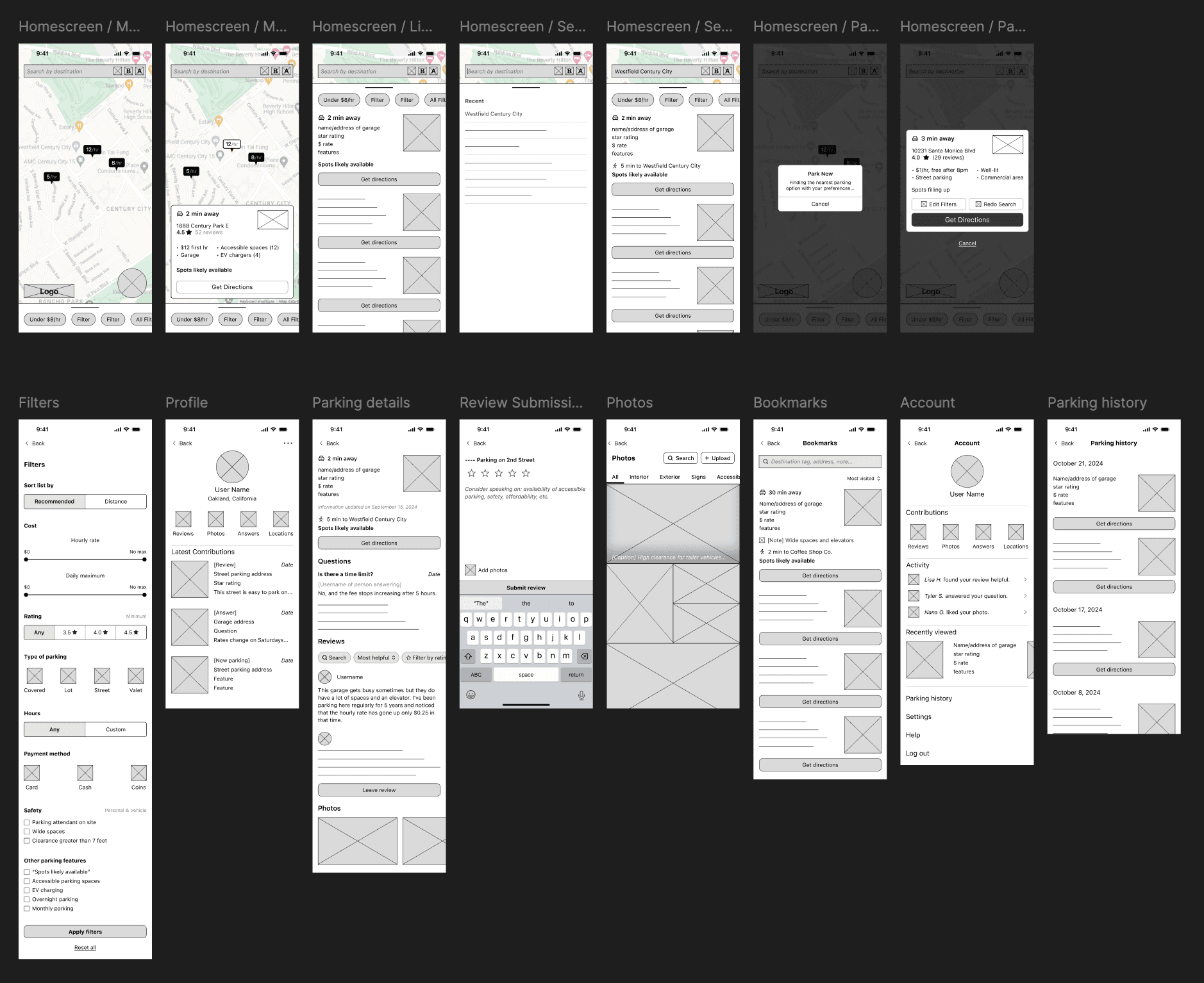
Wireframes
Two interview participants told me that they often ask their friends about what it was like to park somewhere because they wanted to know firsthand experiences.
This stuck with me, and I decided to design an app that focuses on user contributions à la Yelp or Google Maps, while making sure to include specific features related to parking. Below are the wireframes pre- and post-user testing.
Ideation techniques used
Performed How Might We exercises
Created a user journey map of an urban driver and looked for improvement opportunities
Reflected on the competitive audit
Usability tests
I performed 2 rounds of live usability tests with 5 participants in each round. All participants were drivers (aged 23 - 50) in urban cities.
Round 1: Low-fidelity prototype
Round 2: High-fidelity prototype
Luckily, the most valuable UX & product insights were gathered in the first round, and changes were validated in the second round.
The app should adapt to the users' context whenever possible.
All participants stated that they wanted to know the distance from nearby parking locations to their destination. Upon discussing further, I realized that they cared more to know how long it takes to walk there, because that's the most critical consideration in that scenario.
The same goes for driving to the parking site, because sometimes it takes a minute to drive a mile, and sometimes it takes 20 minutes (especially in Los Angeles). It sounds obvious, yet other parking apps in the competitive audit feature the distance.
Furthermore, when testing the initial wireframes, I introduced the concept of a button that allows users to get a parking option instantly based on their location. I asked how it might help them, and the idea was met with positivity all around because of what it could do for them in certain contexts.
I think a button like that could save me in an emergency, like when I've driven to a full parking lot and need another option quick.

Jude, a driver in San Diego
Visual hierarchy is incredibly necessary in a text-heavy app.
Some participants had difficulty scanning for important information. It took one participant over 20 seconds to find the parking spot availability when it was at the top of the details screen.
I addressed this by adding a fixed section containing information users would need quickly, so that they can reach it no matter how far down they've scrolled.

Fixed bottom panel on a parking location's details screen
Users' needs can change depending on the occasion, so they require various parking options — and ways to filter and sort them.
For example, one participant mentioned that they sometimes require overnight parking when visiting family in a downtown area.


Filters panel, including filter for overnight parking, among others
Two participants also wondered about flat-rate and free parking. Would these be included? How would the map markers look?

Map marker variants: consistent yet distinct enough when scanning
Trade-offs & Constraints
Final designs


Want to see how it works?
Reflection
Next steps
There would be a lot to do from a product & design POV.
Consider how the app looks and feels from a contributor's POV.
What does it look like when a user suggests an edit (and how do we evaluate edits)? Is there a way to incentivize people to contribute? Further testing and designing is necessary to round out the app experience.
Test the Park Now button in-context.
In order to measure the effectiveness of the Park Now button, we would need to test it with drivers in scenarios where they are most likely to use it. That way, we can diagnose any issues and make improvements.
Explore an AI-powered voice feature to help with instant parking.
For example, a user could ask “Give me the nearest parking garage that costs less than $10 per hour.” Users would be able to quickly filter and find parking — which would be especially helpful on the road.
Strategies to increase user engagement and encourage “buzz” should be thoughtfully planned and executed.
The app benefits from network economies since most of the information is user-contributed. Growing the userbase is extremely important.
Learnings
Design for a lot of content.
Besides carefully considering visual hierarchy, I learned to use layouts and interaction patterns that users would likely be familiar with from other apps like Google Maps and Yelp.
Build a mini design system.
Because it was necessary to help users understand information at a glance, I produced a set of components, color styles, and typography in order to keep visuals consistent and reduce mental processing.
Avoid feature creep.
I learned how to consider and vet feature options by prioritizing the problem I was solving for.
For example, I avoided adding a feature to book parking in advance as it wouldn't necessarily solve the lack of parking information available (the main issue), drivers' concerns with costs, or difficulty finding parking while already on the road. I didn't want Spotcha to become like other parking apps that limited users to expensive options.
The End
If you're interested in hearing more about this project or others, please reach out and I'd be happy to chat.


