

Team
Product designer (me!)
Software engineer
Disciplines
UX/UI design
User research
Usability testing
Prototyping
Overview
Context
As someone who has spent years in LA and NYC, it feels like there's a million places I could go on the weekends. I wondered how others decide what to do with their precious free time.
So, I conducted interviews and collected insights.
Preliminary interviews
6 participants
23 - 30 years old
Employed
Mid/large cities
People commonly use Google Maps to save places they're interested in visiting, but rarely make specific plans to go.
They find these places on social media or by friends' recommendations.
Lists of saved places can be so large that it becomes intimidating to go through.

"I am not scrolling through this unorganized list to find a coffee shop…"
Because of this, two participants mentioned that they often end up on social media again to try to find a trendy place to go for the day, rendering their saved lists useless in-the-moment.
People often put off deciding where to go until it's most urgent.
They tend to go to new places about once a week, and they decide on a place just one day before or the morning of their free day. This can be stressful, since it can take up to 30 minutes to research + decide because of the desire to make an optimal choice.
Problem
Based on one-on-one interviews.
Young working people want to make decisions quickly about where to go for fun, in order to maximize the time spent actually having fun. But, they also want to make sure that it meets their needs in terms of the hours, location, price point, vibes, and other details. Thus, they feel like they must do some amount of research, which takes time.
Solution Highlights
Busy, outgoing people would no longer have to browse long lists or vet dozens of map pins just to find something that fits into their day.
Want to see more screens?
Process
Preliminary interviews (continued)
One more insight from the preliminary interviews that became a key part of the product concept. Often, people like having the free time to go where they want, but don't necessarily have specific ideas in mind and are very open to suggestions — especially if they trust the source.
If I’m with my best friends or my partner, picking something to do is faster because we trust each other’s opinions.

Jeong Inn, 25, EMT
I take a while to decide for myself, but I usually agree to go anywhere the group suggests. It always works out anyway.

Sam, 26, paralegal
Archetypes
These user groups are similar in that they have limited free time, enjoy visiting new places, and are influenced by friends and social media. However, they differ in their core needs and behaviors.


These archetypes are based on insights from the interviews, in which four participants were similar to the optimizer and two were most like free spirits.
Pain points
Opportunities
After synthesizing my research, I identified some pain points that could become fruitful areas of opportunity. This exercise helped me begin to visualize the product features.

Wireframes
In creating the wireframes, I incorporated features based on the opportunity areas identified. I then tested the low fidelity prototype with likely users. Below are the wireframes pre- and post-user testing.
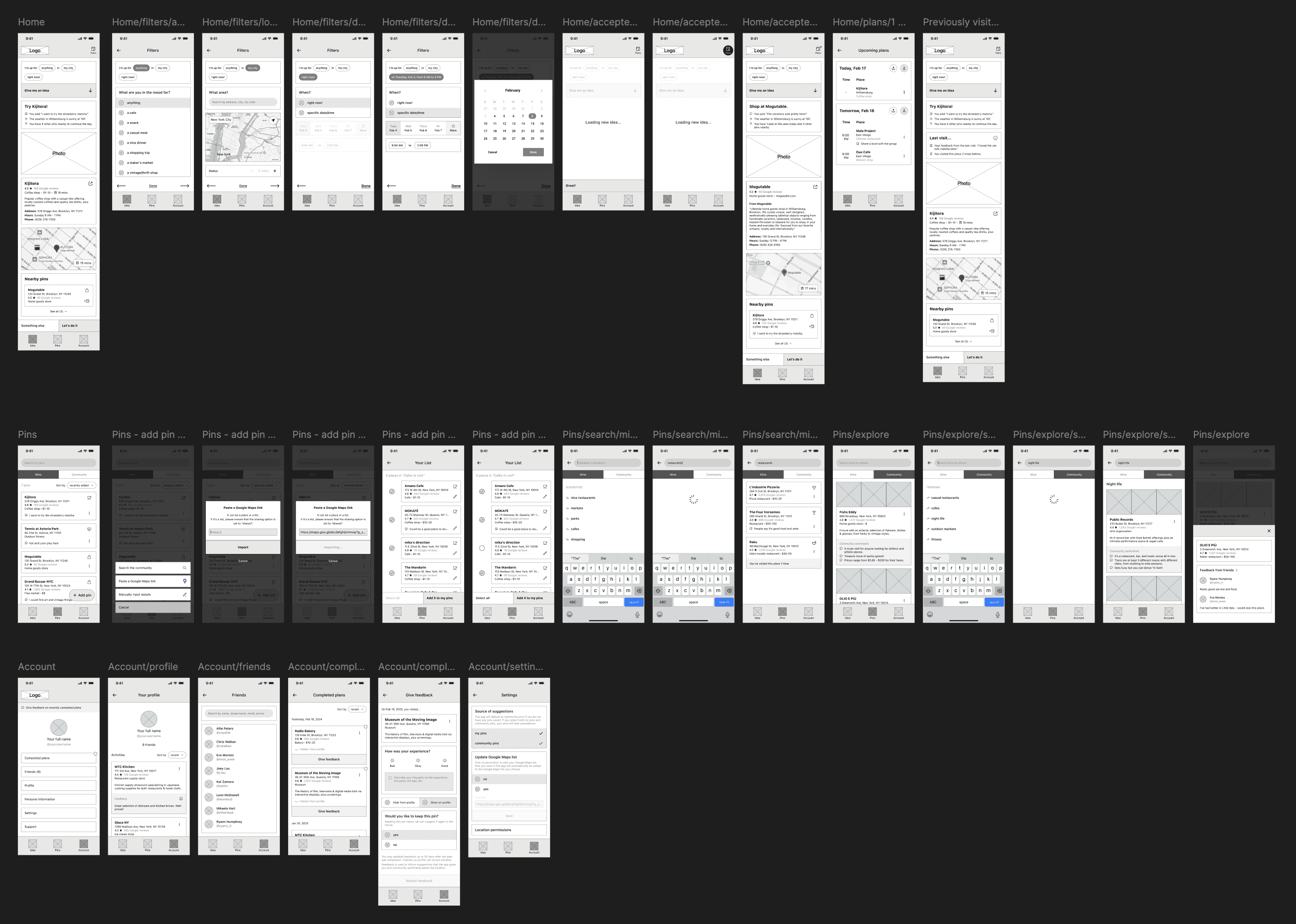
User Flow Diagram for Ideation
Drafting a user flow diagram helped me identify some necessary screens for users to accomplish their goal.

Usability tests
I performed 2 rounds of live usability tests with 5 participants in each round. All participants were working professionals (aged 23 - 30).
Round 1: Low-fidelity prototype
Round 2: High-fidelity prototype
In both testing rounds, participants were asked to perform tasks simulating major user flows, like filtering for and accepting an idea into their “plans", adding a group plan, importing pins, and providing feedback.
Implementing the group planning feature would require a lot of logic design, edge case consideration, and testing — for little reward.
The premise of the group planning feature was to let users plan an outing with friends on the app.


Wireframes of the group planning feature
However, when testing it with users, they brought up a lot of really good questions.

Questions asked by participants
I had much to think about.
Thankfully, participants also described how they currently plan outings with friends, which is that they usually find ideas individually and suggest them in a group chat. They found this method to be convenient, and didn't feel like they needed to force equal control over the group plan.
It hit me that I was solving a problem that didn't really exist.
Ultimately, I decided to scrap this feature, but I'm grateful for the lesson learned.
Animations should clarify rather than distract.
Pre- and post-testing: change in animation location
4 out of 5 participants felt overwhelmed by the animation produced by tapping the "Let's do it!" button. For some, it distracted them from a new time-sensitive CTA that appears at the bottom of the screen. Others missed the animation entirely, because their gaze stayed at the bottom of the screen where they had just tapped the button, rendering the animation pointless.
The intention was to communicate that an item has been added to the user's plans, but it turned into a source of confusion. To resolve this, I moved things around so that the animation occurs near the CTA, keeping the user's focus in one area. This reshuffling actually helped address another critical insight, described below.
Effective information architecture helps users understand relationships between features.
When users accept an idea, it moves into the Plans tab, where they can assign a time to go or link out to get directions.

Before: Plans in the header of the Idea tab
Because of Plans’ nested location, two test participants didn't expect that they'd also be able to add places from the Pins tab to their plans.
Moving Plans to a more prominent location in the bottom navbar makes it more accessible and communicates an equal relationship with both the Idea and Pins tabs.

After: Plans in the navbar
Trade-offs & Constraints
Final designs


Want to see how it works?
Reflection
Next steps
Here are some of the things we plan to do.
Allow users to import pins from multiple sources.
As a team, we've considered that most people have places of interest saved across many social media apps. We researched ways we can process and refine various content data into our pin format, and we're working on implementation.
Design onboarding screens.
As my dev works on the step above, I realized that it may be necessary to teach users how to import from the very beginning so that they get the most out of the app.
To this effect, I am currently working on designs for onboarding. My goal is to make the tutorial portion as simple as possible so that users aren't turned away by an overcomplicated process.
Consider adding a map view for pins.
Having a map view could be really helpful to users for making decisions, especially after they're able to consolidate pins across apps in Now What.
For example, let's say a user has dinner somewhere and decides to go for dessert. With a map view, they could look in the area of the restaurant they visited and find the closest dessert place themselves, which could be quicker than using the idea generator.
Learnings
Think deeply about human behavior to create a better product + clarify scale.
Confusion and complexity around the group planning feature in particular forced me to take a step back and ask, "Who needs this? Is this more convenient than how people currently make plans with friends?" Questions like these saved me from unnecessarily bloating the scale of the project.
Collaborate with a developer.
I was able to workshop some features with a developer and have discussions around feasibility and hand-off, which was a valuable realistic experience.
Iterate, iterate, iterate.
All of the final screens were one out of many iterations. Even the visual aesthetic for this app came from one of over a hundred screens I had to produce as part of a learning exercise. It was good to practice intentionality and question my first drafts.

107 iterations, starting with some ugly screens in the beginning…
The End
That was a long one! But if you're interested in hearing even more about this project or others, please reach out and I'd be happy to chat.


